Comment ajuster un graphique en barres dans Excel pour élargir les barres ?
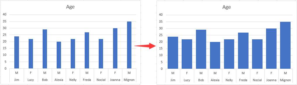
Cet article explique comment ajuster un graphique en barres pour élargir toutes les barres dans Excel, comme le montre la capture d’écran ci-dessous.
Ajustez le Graphique en barres pour élargir les barres dans Excel
Ajustez le Graphique en barres pour élargir les barres dans Excel
Pour élargir les barres d’un graphique en barres, suivez ces étapes.
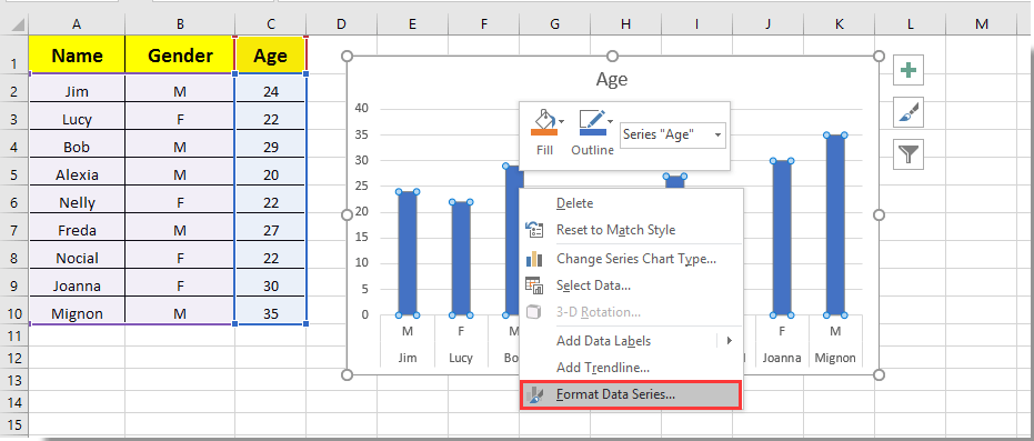
1. Cliquez sur n’importe quelle barre du graphique en barres, effectuez un clic droit, puis sélectionnez Format des séries de données dans le menu contextuel. Voir la capture d’écran :
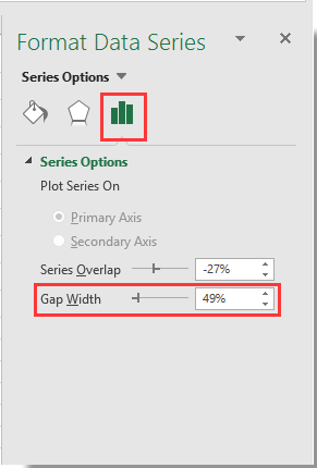
2. Dans le volet Format des séries de données qui s’ouvre, sous la section Options des séries, déplacez le curseur Zoom de la Largeur de l’intervalle vers la gauche jusqu’à ce que la largeur des barres corresponde à vos besoins. Voir la capture d’écran.
3. Fermez le volet Format des séries de données.
Vous constaterez alors que les barres du graphique en barres spécifié s’élargissent, comme le montre la capture d’écran ci-dessous.

Libérez la magie d’Excel avec Kutools IA
- Exécution intelligente : effectuez des opérations sur les cellules, analysez des données et créez des graphiques, le tout à partir de commandes simples.
- formules personnalisées : créez des formules sur mesure pour rationaliser vos flux de travail.
- Programmation VBA : Écrivez et implémentez du code VBA en toute simplicité.
- Interprétation de formules : Décryptez facilement les formules complexes.
- Traduction de texte : Franchissez les barrières linguistiques directement depuis vos feuilles de calcul.
Meilleurs outils de productivité Office
Boostez vos compétences Excel avec Kutools pour Excel et découvrez une efficacité inégalée.Kutools pour Excel propose plus de 300 fonctionnalités avancées pour améliorer votre productivité et Gagner du temps.Cliquez ici pour obtenir la fonctionnalité dont vous avez le plus besoin...
Office Tab apporte une interface à onglets à Office et rend votre travail bien plus facile
- Activez l’édition et la lecture par onglets dans Word, Excel, PowerPoint, Publisher, Access, Visio et Project.
- Ouvrez et créez plusieurs documents dans de nouveaux onglets de la même fenêtre, plutôt que dans de nouvelles fenêtres.
- Augmente votre productivité de 50 % et vous fait économiser des centaines de clics de souris chaque jour !
Tous les compléments Kutools. Un seul installateur
Kutools for Office regroupe les compléments pour Excel, Word, Outlook et PowerPoint, ainsi que Office Tab Pro, ce qui en fait le choix idéal pour les équipes travaillant à travers les applications Office.
- Suite tout-en-un— Compléments Excel, Word, Outlook et PowerPoint + Office Tab Pro
- Un seul installateur, une seule licence— installation en quelques minutes (compatible MSI)
- Fonctionne mieux ensemble— productivité optimisée dans toutes les applications Office
- Essai gratuit de 30 jours avec toutes les fonctionnalités— aucune inscription, aucune carte bancaire
- Meilleur rapport qualité-prix— économisez par rapport à l’achat de compléments individuels